
SuperMoney Financial App
Get A Sneak Peek
Problem Statement
Many individuals struggle with managing their finances due to a lack of financial literacy, overwhelming choices of financial products, and a general lack of transparency in the marketplace. For the average person, navigating debt, savings, and investment options can be confusing, time-consuming, and stressful. There is a growing need for an accessible, easy-to-use platform that simplifies financial decision-making and helps people take control of their financial futures.
The team involved
The team consists of 3 Engineers, 2 Product Managers, CEO, Director of Content, 1 Data Science Engineer, and 1 Product Designer.
As the product designer, my responsibilities were:
Taking part in competitor research, and user surveys
Ideate and find design solutions for requirements
Lead presentations and discussions with the team to gain feedback
Continuous design iterations and prototyping
Simplify as much as possible to make it as easy and intuitive for the user
Product Requirements documentation
Multiple rounds of QA for mobile and web
Working closely with engineering team to ensure implementation is going accordingly

Competitors
We reviewed the pros and cons of 29+ competitors in the personal finance management app space. We narrowed it down to RocketMoney being our top competitor. RocketMoney has a wide audience internationally and has many of the same features we are including like finances, budgeting, and goals. However, our differentiating factor is the actionable insights powered by AI.

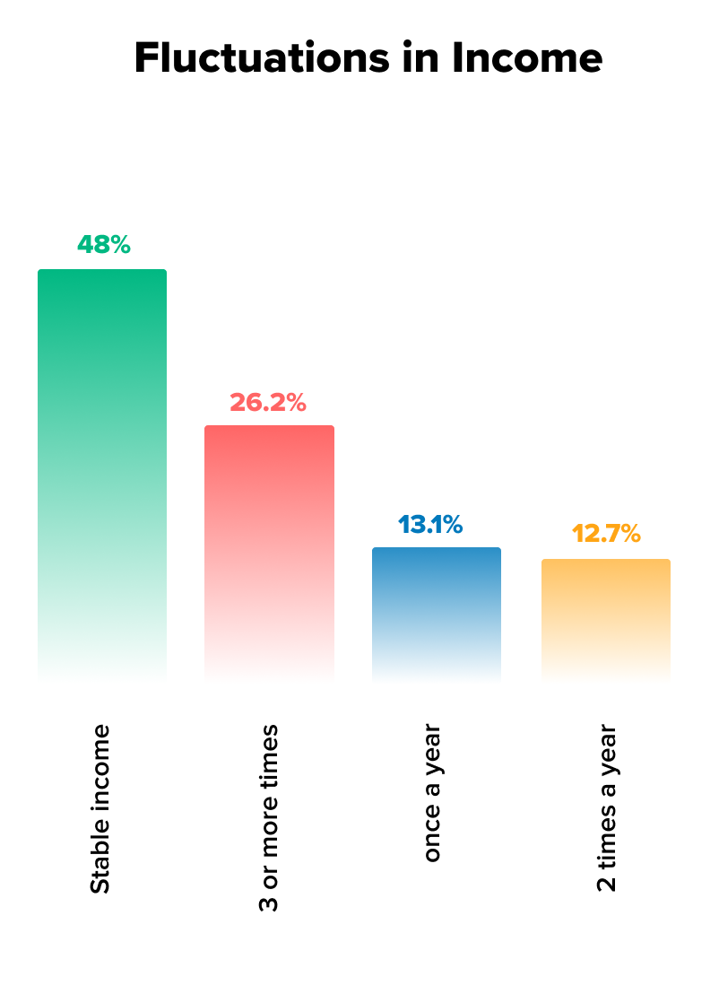
User Survey Findings


Personas

Customer Acquisition Strategy
-
Quote Engine Funnel Transition
We already have numerous users coming into our quote engine funnel to find the right financial products for them in our marketplace. We are utilizing that flow to introduce the concept of goals and get the user seamlessly integrate into the mobile app.
-
Marketing Emails
Using our expansive customer email list, we can use the opportunity to send promotional content for the app. For existing users, we will be providing a teaser insight that will get the users to return to the app and utilize the insights feed.
-
Supermoney.com Advertising
We’ve created a new landing page to promote the mobile app and all of it’s features with social proof data to show that we are a trusted company. We will also have ad placements throughout the entire website to advertise our new app.
Information Architecture

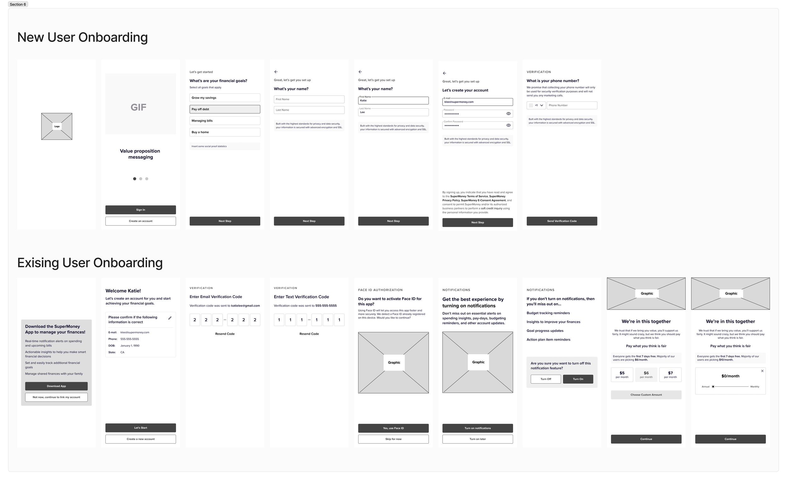
Mobile App Onboarding User Flow

How a new user would start using the app and complete setting up their account.

How an existing user on our web platform gets introduced to the app and transitions over seamlessly.
Web app onboarding user flow
I’ve grouped the iterations into 4 main versions of the app, despite having over 100+ iterations with the team with small updates and fixes. The 4 main iterations encapsulates our thinking process and the major changes.
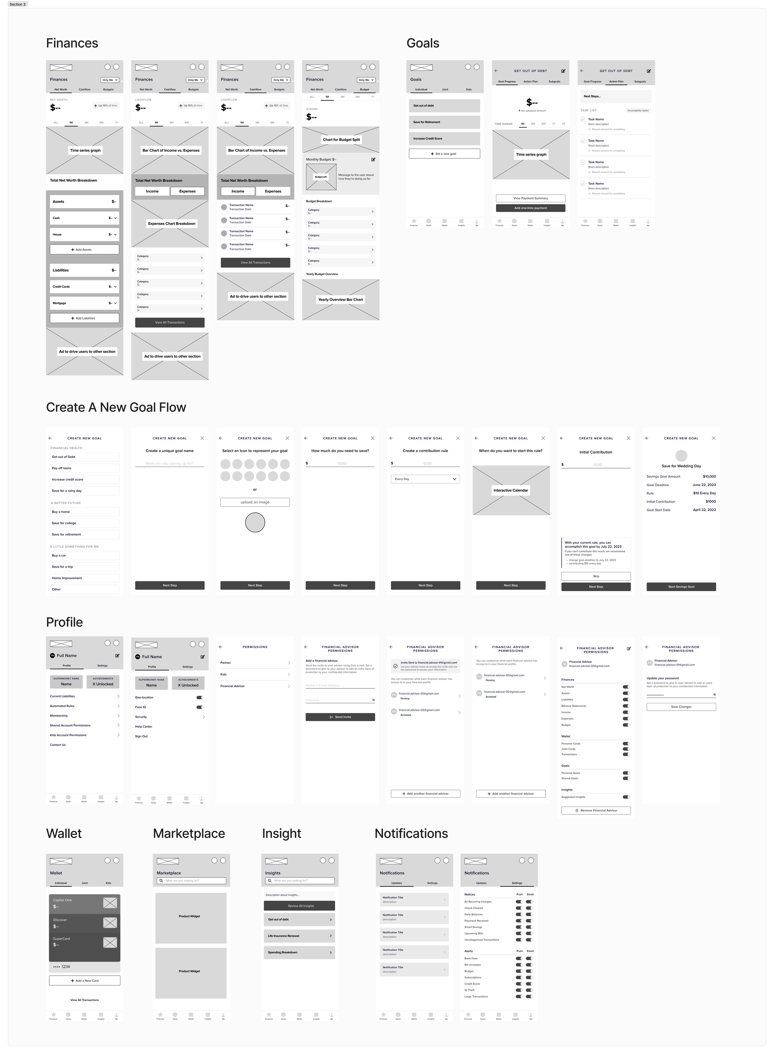
Wireframes & Mockups
This iteration includes the Initial phase of solving for an app that provides the following features: Goals, Net Worth, Cash flow, Budget, Insights, Wallet, Account. Part of these designs were started by the previous Product Designer, and I worked off of these files.
Iteration 1
First Ideation of main features


Iteration 2
Adding a differentiating factor
We introduced the concept of the Shared Finances or Family Finances feature that we believed would set us apart from competitors. We restructured the navigation to be more organized and simplified the UI to be less overwhelming.

Iteration 3
Onboarding Users
We started to think about how the onboarding would work once we’ve narrowed in on the features we wanted to have in the app. We asked the question of what was feasible with the data providers and what data can we collect from the user. We started solving for a seamless transition from our quote engine to the app without much friction for the user. The shared finances were still confusing and not as intuitive, so we introduced separate colour palettes for each option: The individual, child and partner.

Iteration 4
Core product & MVP Refinements
*Note: We started working off of old mockups to further refine the designs.
We reflected on what our core feature should be in the app and deduced that it should be our insights since that is the driving factor of getting users to return to the app. We rearranged and stripped down the product to simplify it for the MVP launch of the app. We removed the wallet and shared finances feature since that was out of scope and removed the goals from the nav and placed it into the main dashboard. The insights have become an infinite scroll UI pattern to keep the users hooked to the financial data being given to them to help them achieve their goals or to further educated them on financial literacy. At the core of our product, it is now primarily driven by an AI algorithm that analyzes your data and informs users with the best answers to help make their financial decisions. The AI chatbot is integrated into our main features — the insights feed and budget creation.

Prototype
Current Launch Timeline

We are currently in the process of launching the app in private beta — meaning available to close friends, family and everyone at the company to use and test. After we have gathered enough feedback and data from users, we can fix any issues and adjust any UI/UX issues that we observe before the public launch.

Outcome &
Key Learnings
Reflecting on this project, I realize that we could have benefitted from a clearer starting point. The initial idea, sparked by the CEO, was quite vague, and there wasn’t a well-defined problem to guide the app design process. In hindsight, we should have invested more time in defining the problem thoroughly and conducting proper research before jumping into design work. I was working off the previous designer’s mockups, which, while helpful, came with pre-existing solutions that subtly influenced my approach. Starting from scratch might have allowed us to explore a broader range of ideas upfront and avoid some of the back-and-forth iterations that followed. While iterations are always part of the process, we could have streamlined this phase and moved closer to a solid solution more efficiently.
Another key takeaway for me is the importance of documentation. With the rapid pace of changes and everyone’s focus on meeting deadlines, documentation often got sidelined. Looking back, keeping detailed records of discussions and decisions after each meeting would have been invaluable. We found ourselves months into the project without a clear memory of why certain design choices had been made or why specific features were cut. Consistently documenting our decisions would have helped us stay aligned and allowed us to reflect on the rationale behind our choices, improving both design consistency and team communication.
Additionally, with limited resources in a small company, the project often felt like a solo effort in the beginning, with just the CEO and me working closely on research and ideation. As more team members were gradually brought in, it became evident that having more input earlier on would have been beneficial. More perspectives in the early stages could have helped us refine the feature set and share the workload more evenly, ultimately making the process smoother and more efficient.
These lessons have helped me understand the value of thorough planning, effective documentation, and early collaboration in ensuring a more streamlined and successful design process.
Curious to know more?
joann.mae.lau@gmail.com